In June, beauty company Glossier quietly unveiled a new logo. Departing from its sleek sans-serif black wordmark, the company introduced a bold, chunky typeface to promote its seasonal capsule collection, featuring hair accessories, lip balm, and a versatile utility sling. This move marks a significant shift in Glossier’s branding strategy, embracing a more playful and nostalgic aesthetic.
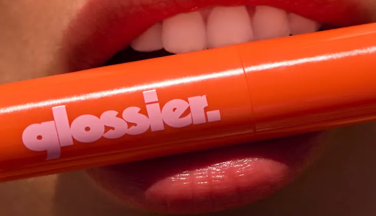
The new logo utilizes VolumeFour, a typeface designed in 2018 by Ryan Corey, inspired by the lettering on Black Sabbath’s 1972 album “Black Sabbath Vol. 4.” Set in a variety of summery hues, the logo evokes the carefree, sunny vibes of beachside days, a stark contrast to the minimalist branding Glossier is known for. This choice reflects a broader trend in branding, where nostalgia and retro elements are being revisited to stand out in the crowded digital landscape.
While this ‘70s-inspired logo is technically a temporary pop-up brand for the summer collection, its reception online has sparked speculation about its potential permanence. Unlike the tightly controlled rebranding efforts of companies like Verizon, Glossier’s approach seems to be a soft launch, testing the waters of a new visual identity without fully committing to a complete overhaul. This strategy allows the company to gauge consumer response and make adjustments as needed.
For a company like Glossier, which has cultivated a loyal and dedicated audience, introducing a temporary brand is a low-risk way to experiment with radical changes. Since its founding in 2014, Glossier has been a poster child for “blanding”—a term describing the clean, minimalist branding trend popular among tech companies and direct-to-consumer brands targeting Millennials. This aesthetic resonated with a generation that valued simplicity and cohesion, especially on social media platforms like Instagram, where a clean, stylized grid was highly sought after.
However, a decade later, the landscape has shifted. As algorithmically sorted feeds and dynamic content like Instagram Reels gain prominence, the need for more distinctive and engaging visuals has become apparent. The static, picture-perfect influencer aesthetic is being replaced by more vibrant and personality-driven content. Brands are now looking for ways to infuse more character into their digital presence, making nostalgic and playful fonts an attractive option.
Monotype, a leading type foundry and retailer, predicted in their annual type trend report that 2024 would see brands experimenting more with nostalgic and fun type choices. These characteristics are evident in Glossier’s summer logo, which taps into a sense of retro charm and whimsy. This trend aligns with a broader cultural shift towards embracing the past, blending it with contemporary design elements to create something uniquely appealing.
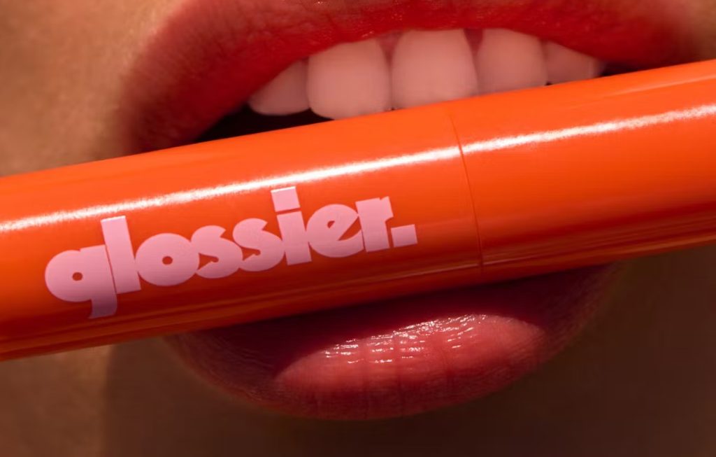
The Glossier summer capsule collection brand isn’t just designed to be photographed against clean, nondescript backgrounds. Instead, the products are showcased in more lively, relatable settings. For instance, the utility sling is displayed across the bare midriff of a model wearing a bikini, while the Ultralip is captured being held by a pair of lips. These images evoke a sense of carefree summer fun, aligning perfectly with the nostalgic theme of the new logo.
Glossier’s strategic decision to employ a temporary rebrand allows the company to experiment without the risk of alienating its core audience. This approach also enables Glossier to stay relevant and adaptable in an ever-changing market. As consumers’ tastes evolve, so too must the brands that serve them, and Glossier’s willingness to innovate with its branding reflects a deep understanding of this dynamic.
The move also speaks to a larger trend in the beauty and fashion industries, where brands are increasingly using limited-time collections and pop-up aesthetics to create buzz and drive engagement. By introducing a temporary brand for its summer collection, Glossier can create a sense of urgency and exclusivity, encouraging customers to purchase before the collection is gone. This strategy not only boosts sales but also strengthens the brand’s connection with its audience by offering something fresh and exciting.
Perhaps Glossier’s pop-up rebrand will be just a summer fling, set aside as the temperatures drop and the season changes. Or maybe it’s an early indication of a broader shift away from the minimalism that has dominated the past decade. Fun and nostalgia are making a comeback, signaling what could be described as the “great unblanding” of the branding world. As brands seek to stand out in an increasingly saturated market, embracing more playful and nostalgic elements might just be the key to capturing consumers’ hearts and attention.